
Certain businesses require in-depth diagrams to help them visualize complex data. This can be for a multitude of reasons, ranging from the need to disseminate specific data points to those in management who may not be as au fait with the ins and outs of a problem, but will have to make a decision based on the data, to really any business seeking ways to discover potential root causes of a complex issues and then systematically drill down to various possible solutions.
While there are plenty of alternatives to the fishbone diagram (which we will discuss), we will explore what makes this specific option so effective at what it does.
What Is A Fishbone Diagram?
We won’t spend too long discussing what it is because many of you reading this will already be somewhat familiar, but for those who are looking for ways to analyze root issues and are unsure where to begin, it’s worth covering the basics first.
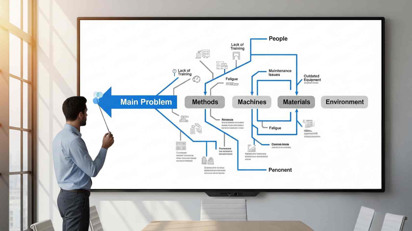
Essentially, it is a diagram that’s laid out exactly how it sounds; in a fishbone configuration. That is to say that there is a central “spine” representing the problem, with “bones” branching off into categories of causes. This sets out a very clear lineage that allows those using it to identify the root of a possible problem and follow the route down to a potential solution, very efficiently.
While they can take some practice to master, using a fishbone diagram template tutorial will enable you to understand in what situations they make the most sense and how to implement them for your specific needs. Once you make and use a few, you will discover just how valuable they can be for a wide gamut of use cases.
Basic Components Of A Fishbone Diagram
As we have already mentioned briefly, there is a central spine that leads down several tiers from a cause to a possible effect. But they’re more than a simple branching diagram, and the way that you utilize the various tiers can dramatically influence how effective they are.
- Head: This is effectively the main cause of a problem or issue that needs to be remedied. It could be something like “high customer churn rate” or “failure to onboard new hires effectively”. Anything that a business might want to address.
- Spine: This is the central line connecting cause to effect. This will run down the entirety of the diagram, connecting the major and minor bones to the head.
- Major bones: These will constitute broad cause categories and include major components of the organization, like people, processes, or equipment etc.
- Minor bones: Here, you will specify the issues, as in the example of ineffective onboarding, which might include very specific reasons, such as “training manuals using outdated information”.
How Root Causes Can Be Determined Using Fishbone Diagrams
A fishbone diagram truly shines when organizations are trying to root out an issue and come up with solutions. Well, you already know that, but how exactly are they useful in this endeavor?
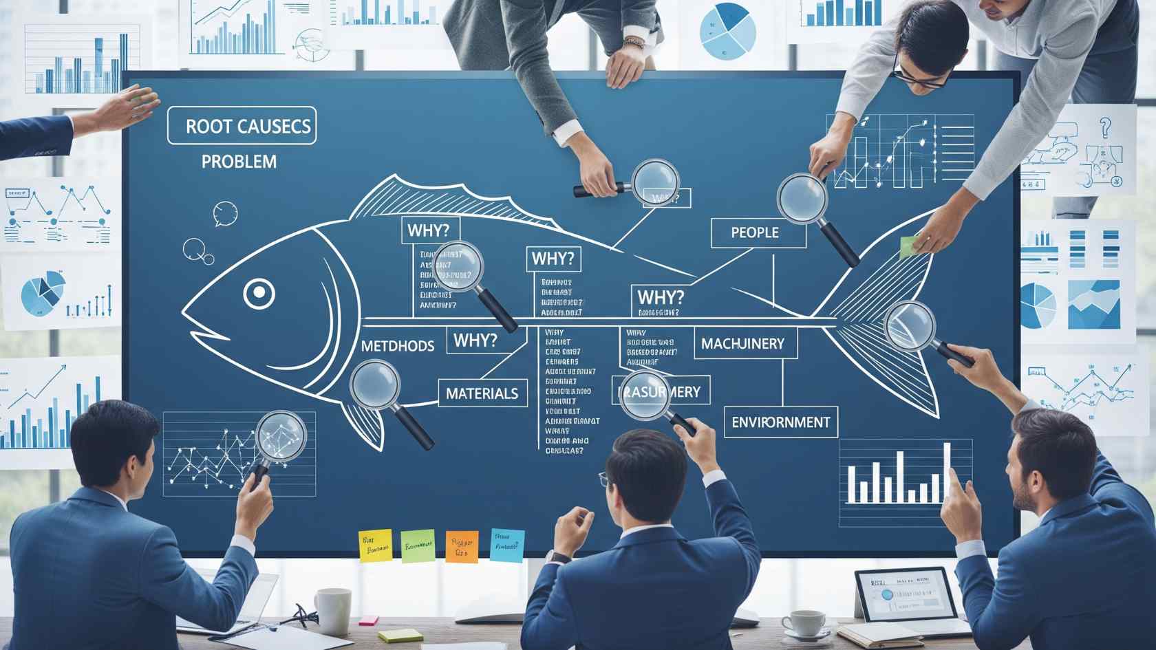
Most obviously, they are a visual way to help members of staff from across a wide range of departments to track the problem and lead them towards a possible outcome. In order to really get the most out of the process, it’s best to create the diagram collaboratively between teams who might be able to work together.
For instance, if your business is experiencing a high cart abandonment percentage that you want to improve, you can work together with your web designers and marketers to come up with their own ideas for the various major and minor bones that come off from the spine.
The idea is that this form of problem-solving encourages a much deeper way to discover how seemingly disparate options might actually come together to form a solution. In other words, it encourages systematic thinking over guesswork.
Steps To Create A Fishbone Diagram
While they may look simple (and they can be if you only have a few problems to contend with), they can be challenging for first-timers to create.
| Action | Application |
| Define problem | To get the most from these diagrams, you need to be as specific as possible (e.g., “delay in order fulfillment”, “high staff turnover”). |
| Draw the diagram skeleton | This can be done using old-school whiteboards for an initial plan, and then placed into dedicated software to develop it further. |
| Brainstorm causes | Ask “Why?” for each branch; aim for 5-10 sub-causes per category. |
| Analyze and validate | For the most impact, you need to constantly gather data based on the real-world implications of using the diagram. |
| Develop solutions | For each root cause, brainstorm actionable fixes that might actually move the needle as opposed to pie-in-the-sky ideas that look great on paper, but won’t amount to much. |
Alternatives to Fishbone Diagrams And Their Uses
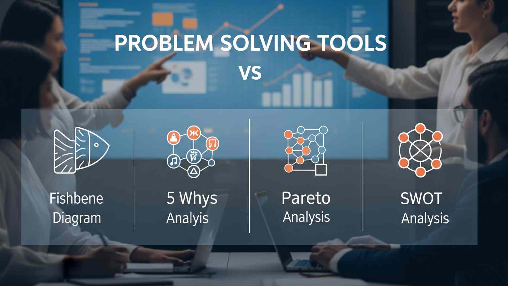
In most situations, a fishbone diagram will help you to develop actionable strategies for your problems. But they aren’t the only option around, and knowing a few of the others can help you to choose which may suit your specific circumstances best.
- 5 Whys: A 5 Whys diagram can often be a great way to begin your task. It is simpler and better-suited when time is of the essence. The primary downside is that they are generally used with single-issue problems and may miss interconnected causes that make fishbones so great.
- Pareto analysis: Focuses on the 80/20 rule for prioritizing issues and helping you to decide which solution will result in the best outcome with the least amount of effort. To be effective, however, it needs a lot of quantitative data upfront, which isn’t always possible.
- Flowcharts: Somewhat similar to a fishbone, but more suited to sequential processes rather than looking at an issue in an all-encompassing manner.
- SWOT analysis: The good old SWOT analysis that has been used for decades is a great choice for high-level strategic planning, but can become a little cumbersome when you start to add in more and more variables..
A fishbone diagram is a brilliant technique to condense a large amount of data into a visually pleasing and practical. While there are alternatives you may consider depending on your desired outcome, for those seeking a way to see lots of issues and solutions from afar, a fishbone presents the best of all worlds.